70% of all online shoppers browse and purchase on a mobile device.

SEVENTY PERCENT?! Yep.
So if your eCommerce site isn’t optimized for mobile, you better get to it. Mobile users are conditioned to instant gratification from liking, swiping, double-tapping and watching on-demand. Your website should be no different, it should seamlessly fit in with a mobile users experience. With 79% of all online shoppers converting on a mobile device, ensuring our mobile site experience is top-notch is absolutely crucial.
Even Google rates mobile experience as one of the most important tests of performance for organic ranking, so if your site has poor mobile performance, not only will you lose sales but chances are Google won’t even show your site in the first 2 pages of search results.
Not to worry, we’ve wrapped up our top 8 tips to improve your mobile site in order to increase conversions.

64% of smartphone users expect a website to load in 4 seconds or less and 53% of mobile users will exit a website if it hasn’t loaded in 3 seconds.
Speed is crucial. If your site is slow, you’re throwing away sales. Test your site for speed using tools from Google & Shopify. Improving your site speed on mobile should be our first port of call here.
You can reduce loading time by doing the following things
Ensure that your design is responsive to the user’s device. There is nothing worse than loading a site on mobile that isn’t responsive. The user is left to try and navigate the site as if it was on a desktop, the text will be too small, menus will be hard to use and the overall experience is just miserable. Thankfully, most Shopify themes include mobile responsive designs, but if you’ve customised a theme or added something custom in, it’s extremely important to ensure that images, CTA’s and menus are resized according to the device and are not difficult to use on mobile devices.
If a user has added an item to their cart and have reached the checkout stage, you better hope that the checkout page is easy to navigate, and the user can enter their details with ease. Forms and checkouts that aren’t responsive or make it difficult to use are a sure-fire way to losing a sale. Studies show that up to 28% of users will abandon a cart if the mobile checkout process is too difficult.
Thankfully for Shopify users, the Shopify checkout is lightning fast. Even better if you’re using ShopPay, users can usually check out without having to re enter details and the sale can be complete in just a few taps.
Using pop up forms and announcement banners are a great way to convert customers on a desktop, but on mobile, it’s best to turn these off. They can often be very annoying to the user and hard to close on mobile if you haven’t created mobile friendly pop-ups. An oversized, hard to close and frustrating pop up on mobile is the fastest way to get a user to leave your site.

Users leaving your slow page to go to your competitor
Tools like Klaviyo, allow you to edit the mobile and desktop versions of pop-ups, so if you absolutely must have one showing for mobile users, make sure you’ve edited it and tested it on mobile before setting it live.
Keep your CTAs and buttons such as Add to Cart or Checkout Now, relatively close to the op or middle of the page. If the user has to scroll for it, chances are they won’t click or tap on it. Your product pages should be optimised to fit the most important product information, images and CTA button within the first page or scroll. Make sure your navigation menu os clear too, either make it sticky so it follows the user as they scroll through product pages, or add a prompt that allows the user to scroll back up to the top with one tap.
We keep harping on about personalisation, but it really is the key to eCommerce success. Personalise the shopping experience for the user. Use apps that harness AI to give personalised recommendations. According to Google, users are 40% more likely to spend more than planned when they identify the shopping experience to be highly personalised. If you can personalise the consumer experience to each user, you’re likely to increase not only the size of the order but the Customer Lifetime Value too. Customers who feel valued, are far more likely to return and shop with a brand again.

There are so many tools and apps available to enhance customisation. Using apps available in the Shopify App store such as Selly, Rebuy and Frankie use AI and rules set by the merchant to recommend products, bundles and cross-sell products based on the users’ cart or what items they’ve viewed. We’ve actually done a whole podcast episode al about these apps and how you can add personalisation to your store. You can listen to it here.

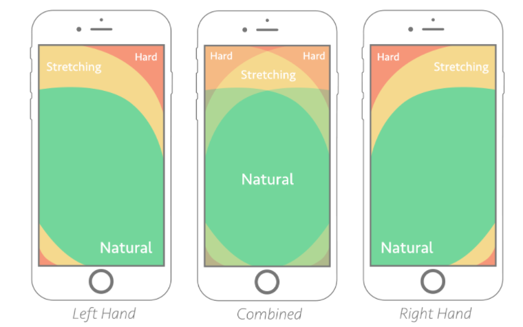
Consider the location of your menus, navigation and CTA buttons. Are they easily tapped by a mobile user with their thumb or fingers? Some Shopify themes even put the navigation at the bottom of the screen for easy navigation with a thumb. See the below image for zones that are best for CTAS.
Data is your best friend. Benchmark your conversion rates and bounce rates for mobile. Find out which pages are converting and which ones aren’t. If Google Analytics isn’t your source of truth, we highly recommend setting up your GA account and have it tracking mobile activity on your site.
Analyse: Look at the data. Like really look at the data. Understand what it is telling you about how your users behave on mobile. Set up custom reports in Google Analytics just for mobile users and look at things like bounce rate, time on page, how many pages they viewed and the highest converting pages. Understand where some sticky points may be or where customers are falling off.
Test: If you find one page that is performing pretty poorly and perhaps has a very high bounce rate, implement some of the above techniques. Test something new, take down a pop up, or move the location of a CTA button. Se up A/B test pages with different options on mobile. Then after 30 days, compare data. Did things improve or get worse? Where can you see changes?
Implement: What did your test show? Did removing the pop up on a page increase time on site? If it’s working on your test page its time to implement it across your entire site.
Repeat: It’s important to continually check in with your data and performance. You should be reviewing this data every 2 weeks or every month at the very least. If you notice that users are consistently navigating away from a page or from the checkout, you need to investigate why. It’s equally as important to understand what is [roving highly successful, understand how your customers like to be guided through your site to checkout.
It’s important to remember that the customer experience is everything. If all else fails and you get confused with too many metrics to track or feel overwhelmed with all the changes you might need to make, always come back to the user experience. Anything you can do to make the journey from landing page to checkout frictionless, personalised and quick – you’re onto a winner.


