Welcome to Zyber’s ultimate guide for web design in Auckland, New Zealand. The goal of this guide is to provide a comprehensive overview of the most important aspects of web design for Shopify.
Web design is constantly changing, and so will this guide. The information you’ll find in this guide is based on the knowledge we’ve gained over ten years in the website design and business development industry. We’ll also link to guides written by other experts.
Are you ready to dive in?
This is a brief overview of this topic- we have a much more in-depth guide on this topic which you can see here.
A Brand Mission Statement defines your company’s broad goals, the market need it hopes to fill, and the policies it will implement in order to achieve that. For example, Ferrari Industrial Fan Technology’s mission statement is:
To be the reference company in the market of small and medium-sized industrial fans.
The market demands complete solutions: the quality product with a suitable pre-sales support, an impeccable delivery service and a timely assistance of the installed fans.
[To] maintain [a] high level of competitiveness focusing on… expertise… organization… keen understanding of the market [“on the ground”] innovation, [and] professional ethics.
You want the statement to be specific and actionable while being short enough that you can reference it every day.
This is the tone of voice your brand uses in communication, visual, written, and verbal. It’s important to define this so that your brand experience is consistent. Mailchimp’s tone of voice is different than Cards Against Humanity’s, which is different from the New Zealand Legislation website. However, the tone is always consistent, meaning visitors know what to expect when dealing with the brand.
Define the tone of voice your website takes in a few words, considering the effect you want to have on visitors. e.g. “Casual- to make the visitor feel comfortable,” “dark and sardonic- to communicate the tone of our humor-based card game,” “professional and serious- because we are providing legislative information.” Keep this phrase in mind when writing content for your website. Once you have your brand voice defined, you can ask yourself if what you’ve written is on-brand, to create a consistent style
Again, there is an entire industry, Graphic Design, which is tentpoled by creating and researching exciting font choices and colour schemes. All you need to do is choose 1-2 fonts for your brand (use Google Fonts to ensure that all browsers will be able to display the font).
Use this tool to generate a color scheme- lighter schemes tend to look better on phones and monitors. Be sure to store the HTML color codes in your…
Simply, this is just a .pdf that stores all the above information. You can put a lot of effort into creating a Brand Manual, and the result will be a sharply-defined identity. If you have an inner graphic designer, let him or her go wild. Here’s an example of a brand guideline from one of the world’s most iconic brands.
But you don’t need to make a massive time investment- something simple is absolutely fine. The most important attribute of a brand manual is that it’s a repository for all the branding information you’ve just defined. It’s a reference tool.
Whenever you create content for your website, you can use your Brand Manual to ask yourself if your new content is in line with your mission statement, if it’s conveyed with the appropriate tone of voice, and if its appearance matches the rest of your branding. A valuable thing to keep on your desk.
This is a brief overview of this topic- we have a much more in-depth guide on this topic which you can see here.
We find that, for websites in Auckland, imagery is the most important element of your website. You can get away with an average design if you put the effort into interesting images, as you can see on Dumbo Townhouses. Professional photography has benefits if it fits your budget. You can, however, get great results doing it yourself.
Should you display your products being used by a model, or against a white background? Should you display the product inside or outside of the packaging? Does your product have a lot of components- could you knoll it?

The composition of your photo is important to consider. Consult your brand manual for ideas. If you’ve decided your pottery brand should feel chic yet playful, you could use a product image like this:

You don’t need to splash out on photography gear. Using your smartphone is fine, but try to use a DSLR camera that can shoot in the RAW image format, and has a manual settings mode. If you don’t have one, borrow one from a friend. Ideally, you want to shoot your photos with your camera attached to a tripod, to minimize camera shake and to have consistent image presentation. If you don’t have a tripod, you can make do with a pile of books.

For a simple product photo shoot, create a “sweep”- a large piece of paper attached to the wall at one end and a table at the other, creating a curved backdrop.

This will create the impression that your product is floating in a white space, instead of sitting on a table.
For lighting, it’s best to do your photo shoot near a big window, to take advantage of the natural light. You can use a piece of white cardboard, as seen in the image above, to bounce light into the shadowy side of your product. This will help your product have an even amount of light.
It’s easy to be daunted by a DSLR if you’ve never used one before. Here are the essentials you need to know:


5. Size your image to be about the same size as they will appear on your website. Save them as .pngs, then compress them using an image optimizer such as Optimizilla to get the smallest file size (and thus fastest loading times). Use this Shopify guide for more information on great product photography.
This is a brief overview of this topic- we have a much more in-depth guide on this, which you can see here.
Now that you have your images and branding defined, you will need written content to go with it. We’re written an in-depth eBook on writing product descriptions, specifically targeted for Auckland-based eCommerce sites, but here are some quick guidelines for you.
Copywriting must tell your story to the visitor, as well as tell search engines what the page content is. We’ll cover Search Engine Optimization later in the article (click here to advance to that section), for now, let’s concentrate on making your writing appealing to a reader.
No matter what tone-of-voice you choose for your brand, it’s best to sound like you’re an expert on your product, which you are!
You should make sure you include a satisfying amount of content. What that constitutes differs on a case-by-case basis, but here is some commonly-found information to consider including on your eCommerce store:
To cope with the vast amount of content on the internet, most users scan web content, rather than reading it. To ensure they see the most important information, use hierarchical subheadings (Heading 1, heading 2, etc.)

To make your most crucial points apparent, use bolding and italics.
Avoid using HTML tables. Because they will break your page on mobile. Use a font size between 11 and 13 pts. Content doesn’t just mean words. Rich media such as videos and .gifs bring engagement- there is a direct correlation between presence of Rich Media and lower bounce rates. Videos are a fantastic way to demonstrate your product, particularly if it performs an action (such as an appliance.) Avoid using exclamation marks! Or ALL-CAPS.
This is a brief overview of this topic- we have a much more in-depth guide on this, which you can see here.
We’ve talked about copywriting for your website, but we have an additional resource on written content we feel it’s important for you to know about: product page descriptions.
Why are product page descriptions so important? Of all text on your website, this is what customers are most likely to read when they are making their buying decision.
They are also comparing the information they find on your product page against your competitors.
Of all words on your website, the product page is the most critical. And yet eCommerce stores often skimp on this information.
All things being equal, shoppers will choose the item with the lowest price. So if you’re not offering the cheapest possible solution, you need to demonstrate to the shopper why it’s better for them to invest more money in a superior product.
Here’s how you do this:
1. Compare to Competitors
In order to show shoppers that you are the superior choice, you need to understand who they are comparing you to. Start by Googling your “purchase-intent keyword”, simply “buy [product] [location]”

Open up the top-ranking results (including ads) and, if the link doesn’t bring you there already, navigate to the product page.


From here, make a list of what features and benefits these pages are claiming:
Consider what about your product makes it the better buy, and explain it. If you have a similar product, you can always go into more detail about what the benefits are. So, for example, if your product also comes with a free cleaning rod, you can talk about how the cleaning rod is also dishwasher-safe, reusable, and guaranteed to remove all residual flavors so you can switch from coffee to fruit juice and get a great taste every time.
You want to present a logical argument for your offer being the best. However, people do not make decisions purely based on logic. You need to consider their emotions as well.
2. Make a Connection
One of the most important emotions online shoppers need to feel is security- they will not buy if they are afraid that your website do harmful things with their personal information, fail to provide a refund, not ship the products, or any other potential problem.
The best way to get around this is to include links to your shipping and returns policies somewhere on the page. Use an icon displaying what payment provider you use, so customers can trust their data will be secure.
But more than that, people want to know that others have bought the product, and are happy with it. You can do this with a reviews block app, such as YotPo Reviews.

But that’s not all you can include: personal testimony about why you chose to sell this product makes an important connection with shoppers: it humanizes you, and shows that you’re not just dropshipping products from AliExpress, but are offering this product because you want to improve people’s lives.
A great example of this is Patney.com – it shows that the creator of this product is not a faceless manufacturing concern, but a fellow Kiwi who had struggled with the same issues that her potential buyers have. She even has her image on the site.
For even more information on having the best product page you can, read the guide by clicking the button below. Also, be sure to read the section on conversion rate optimization– it discusses split testing, which is a technique you can use to reliably increase the performance of your product page every single day.
You can’t sell anything if users can’t find what they’re looking for. Since it’s easy to accidentally create convoluted website navigation by accident, put your website to the test- grab a friend who is not familiar with your website and ask them to find a given product on your website in 20 seconds or less. If they fail this test, you need to re-think your site navigation.
Some things you can do are…
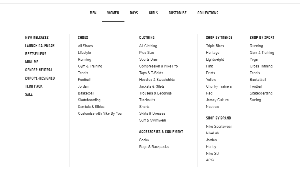
Another way to organize your products is by using a mega menu. It allows users to see the entirety of your offering at a glance, while keeping things tidier than Shopify’s in-built dropdown system. See it in action on Nike’s website.
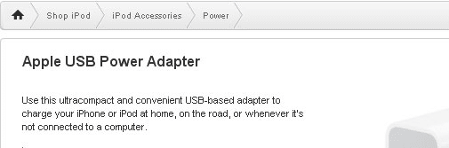
Consider using breadcrumbs on your inner pages- this is a trail of links that brings the visitor back to the higher-level category. These work great because they are placed out of the way- invisible if you don’t need them, but useful if you do. You can see this in action on the Apple store:
If your website’s been online for a bit, you can find insight into the user navigation experience by looking at how your customers interact with your website. Look for the most-viewed page in your Analytics application. Is it a different page from what you expected? If not, perhaps it’s hard for people to find. Consider linking to it from your homepage.
Consider using a heat mapping tool such as HotJar. This creates a map of the average path of a user’s mouse, and looks like Predator Vision:
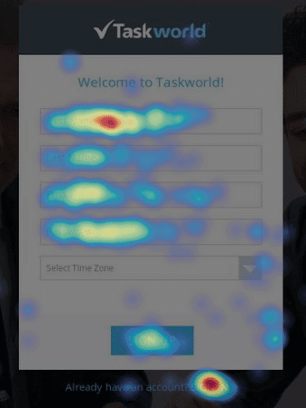
This can help you make decisions about how to reorganize what’s on your website- for example, in the above image, it looks like not a lot of people are using the time zone and last name fields- this form might do better without these fields. Which brings us to our next topic: conversions.
To understand conversions, you need to understand Google Analytics.
We have a guide about using Goals in Google Analytics. Click here to read our article on Google Analytics Goals.
What if I told you that you can double your sales with the same amount of traffic? This is the discipline of CRO- Conversion Rate Optimization.
A conversion rate is the percentage of total users who take a given action on your website. That action can be anything from completing a purchase to visiting a certain page.
For example, if you had 10 sales last month, and 1,000 total visitors, you have a 1% conversion rate. Customers need to add products to their cart before they can make a purchase. So if you had 40 adds-to-cart last month, that’s a 4% conversion rate.
Once you know the conversion rates for the key stages of your website experience (Homepage to Collections Page, Collections to Product Page, Product Page to Cart Page, Cart Page to Checkout, Checkout to Order Confirmation), you can ask yourself what you can do to convert better.
Using our example, we can ask if there is anything on the cart page that is causing users to not proceed to the checkout. Perhaps your customers get scared off by a surprise additional cost when they reach the cart page. We could experiment in making changes to your site by factoring shipping costs into your prices, rather than adding them on the cart page. If you experience more sales, with the same amount of traffic, you may have just optimized your conversion rate!
The best way to test the effectiveness of a potential change is by setting up a split test. This creates two versions of your page, displays different versions to different users, and evaluates which version caused more users to take a given action. You can use tools such as Google Optimize to achieve this.
Any apparent factor of your website has the potential to be optimized. Some stores even experience a conversion lift by changing the color of their “Buy Now” buttons- don’t underestimate the importance of even a small detail, it’s not unheard of to experience an increase in conversions when split-testing a brighter color on important buttons.
Here are some ideas for split tests:
You can split test anything, as long as you have enough traffic, Auckland-based or otherwise, to make a conclusive decision. If you continually make changes to optimize your store’s conversion rate, your website’s performance will continue to improve.
Mobile traffic now accounts for the majority of internet traffic. You need to treat the mobile version of your site as a second website. It’s a good idea to apply what you’ve learned so far in this guide to the different sections of this guide to the mobile version of your site- are your images clear and appropriately sized on mobile? Is your text readable? Is there too much of it? Does your site display correctly across all devices, i.e. is it mobile responsive?
You can check your site for mobile responsiveness using a tool such as BrowserStack. You can use any type of device and any operating system to ensure everything is displaying as it should.
In your Analytics package, you should look at your traffic by device mobile/tablet and desktop. This can help you find errors on your site- if your desktop homepage has a 40% bounce rate, but your mobile home page has a 90% bounce rate, you know there is something to fix.
This is a shortened version of our longer article on SEO. Click here to read our On-Page Optimization Guide.
SEO is a vast topic, but the most crucial concern is making your website friendly to Google.
In Shopify, you have the ability to control how every page appears on Google’s Search Engine Results Page (SERP)
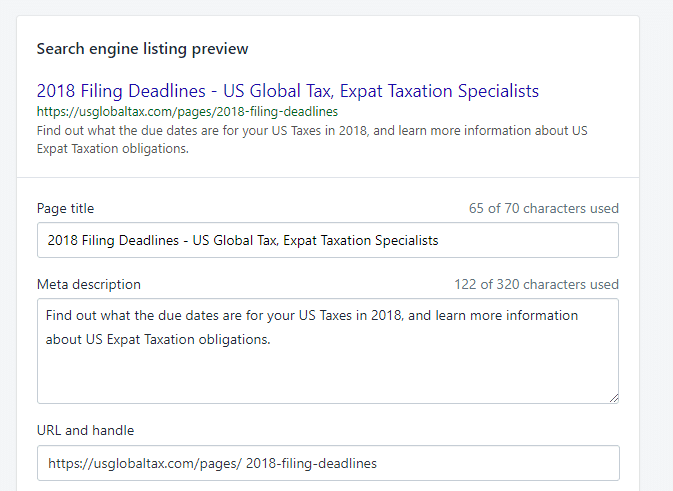
Google uses keywords to determine the content of a page, and puts special attention to the Page title, so make sure the words you want to rank for when someone uses Google are included in your title tag. Don’t overdo it, though- Google penalizes “keyword stuffing.” Use your keywords to create an enticing headline for searchers. The meta description isn’t as important, since Google doesn’t use it as a ranking factor. Instead, use it as an elevator pitch as to why someone should visit your site. Meta data can also be contained in the alt tags of your images, and the title tags of your links.
Another crucial factor in SEO is site speed. Use Google’s PageSpeed Insights tool to see your current site speed: The longer your site takes to load, the less Google will favour it (though SiteSpeed is one of about 200 ranking factors.) This report can provide insight on what you should do to improve your page speed.
Speed correlates with revenue per user. According to Digital Darts, Walmart found: “For every 1 second of improvement they experienced up to a 2% increase in conversions” and “For every 100 ms of improvement, they grew incremental revenue by up to 1%”.
Use Google Search Console to see what searches you are currently ranking for. This can also alert you to any pages that are returning errors. You can deal with errors by creating a 301 redirect within Shopify. This sends visitors away from a broken URL and puts them instead on a similar page. Be sure you submit your sitemap to Google Search Console, so Google knows to crawl or re-crawl your website.
There are many subdisciplines of SEO. Here’s a quick hit list summarizing what is involved with each. We’ll be writing detailed guides on all of these topics soon:
You should now have a broad-stroke overview of what you need to consider on your eCommerce web design journey. This is only a glimpse of the surface of all these topics, so be sure to keep educating yourself on web design in order to stay on top of the topic.
Zyber is a Digital Agency with ten years of experience in Web Design and eCommerce. We can help make the process of creating an eCommerce store as easy as possible for you. Use this form to get in touch with us, or call us on 09 280 3680 to discuss how we can help you.
We are constantly updating this page, so you have the latest information about website design. Join our mailing list to be notified of the biggest updates.