Having images on your website is bad.
Open this webpage:
Open link - https://www.gov.uk
It loads in 337 milliseconds, thanks to all the images it doesn’t have.
An imageless website loads fast, works on every device, and gets the point across. What’s the point of having an image of someone writing “planning” in a notebook?

When it comes to web design, responsiveness and fast loading times are critical to a good conversion rate and high Google rankings. A slow website can affect its performance:


For our zyber.co.nz homepage, images take up more than half of our website’s size:
What a trammel visuals are! why have them at all?

According to a study by three professors of Management Information Systems from the University of Minnesota, visuals help you persuade, and after all, if we’re using our websites for business, we’re trying to be persuasive- we are using communication to influence choice.
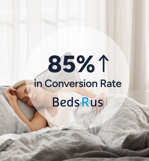
We looked at the data from one of our clients, Ruby Rose Flower Studio, comparing their site’s conversion rate from before vs. after we updated their site, the chiefest update being an overhaul of their imagery:
So the right images can help you. They can definitely be misused to your detriment, but you can use them to your benefit, to optimize your website’s performance, to get more sales and more leads.
This is an article about using visuals- images, icons, video, gifs, and even new media like Augmented Reality, to get your point across. We’ll look at how to plan the visuals of your key pages for effective communication, how to create videos that communicate your idea, anything you can use to show people what you’re all about.
Visuals Create Feelings
Look at this skin care product photography from The Warehouse:

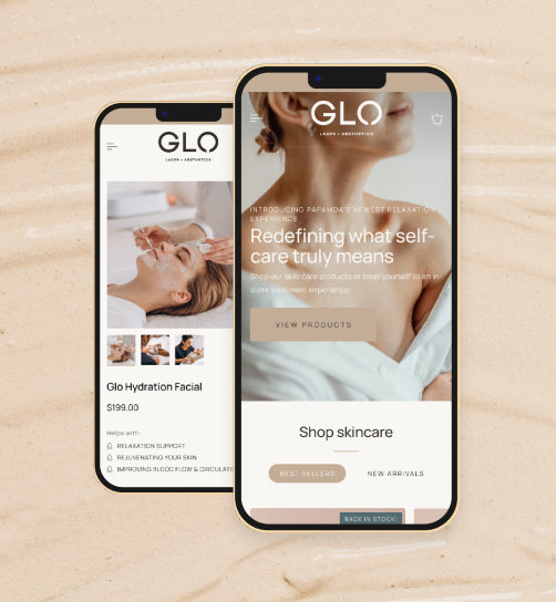
And compare that against another of our clients, Re Skin:

By putting the product amongst an earthy setting, it communicates the promise that this is an all-natural product.
The colors are desaturated, and this idea is applied throughout the entire website, to create a relaxing, earthy vibe.

The shoes are brightly colored, the image shows you different angles so you can inspect the sole, and the backdrop gives it that “high-performance sports product” feel.
The style of your images create feelings.
Conventionally, eCommerce products are “clear-cut”, meaning that the backgrounds are removed and replaced with a flat color, or transparency, so the image will blend in with the background of the web page.
Research: eCommerce
How are your competitors using imagery? Let’s take a look into how to conduct a competitor analysis for a product. We’re going to focus on product pages, but you can (and should) apply this logic to any page you create on your website.
Let’s say our product is beard oil. The first thing you should do is Google your transactional keyword (e.g. “buy beard oil NZ” )
Let’s open up all eCommerce stores that are ranking for this search term, and look at their product photography. You’ll see some appear to be photographed on a phone, using a piece of computer paper for a backdrop:
Ignore the ones with obviously low production value, and Look for the images that are presenting the product in an interesting way:
It’s fine to have a clear-cut image. They are the clearest way to explain what your product is. But look at what other visuals are being used on the site, other than product images.
Some of these product pages have instructional videos:
Some use iconography to sell the product:
Some include their product as part of a still-life of luxurious yet manly goods:
Some put the ingredients next to their products:
Some present the product with interesting lighting (note the shadowy edges of the background and the light refraction shining through the bottle:
And note the memorable image that accompanies it:
So there are a lot of different ways that simple beard oil can be presented.
If you were to have an eCommerce site ranking on the first page of Google for “buy beard oil NZ”, your website would be appearing alongside these sites.
Your visuals will be competing against theirs to do their job of impressing the shopper and winning their attention. So how are you going to convey your product information better than your competitors?
Keeping up with the Joneses
If you’ve ever bought a nicer lawnmower just to wipe the smirk off your John-Deere-owning neighbour’s face, then you have what it takes to make awesome product photos.
Think about what your product is, as a physical object. For example, our fictitious beard oil product is little more than a glass bottle. So let’s go to a website geared towards photographers sharing their best shots, such as flickr, and see what results show up for “glass bottle”
Now, create a mood board to help you organize the different visual ideas you like. A software we like to use for mood boarding is called PureRef.
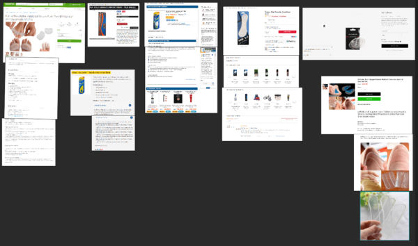
Pretending that our beard oil brand was going for a grungy aesthetic, here is a mood board of bottle images.

This is a valuable tool to use when working with your product photographer: you can show her the mood board, and say “I like how shadowy these bottles look in this photo, but I wish they were arranged like this photo”. A good photographer will be able to identify the photographic techniques used to create the image (lighting, angles, post-processing, filters, etc.) and, if they are experienced, will be able to come up with an interesting-looking result.
Research: Lead Generation
What if the purpose of your website is to book leads? You can use this same technique. Let’s say you’re a dentist, offering free examinations, and you want to make sure your landing page is superior to all your competitors.
First, Google your transactional search term- in this case we’re using “dentist auckland”.
If you’re not sure what your transactional keyword would be, just think of what someone who needs a dentist would Google.
These are the results that show up:

You can check out the Paid search results as well (identified with the green “ad” icon).
Next, read through their landing pages. What are they saying to convince you to book an appointment with them, and how do the images help tell that story?
One of the pages had icons that are doing a great job describing what the service is:
Images of key staff members are very useful- other than the home page and contact page, we’ve found that on lead generation websites, the most popular page visited is the “about us” page.
If you have multiple branches, a store locator can be very useful for your visitors, especially if you take walk-ins:
Icons of societies you’re accredited with are a great way to show visitors, who might have had a bad experience with dentists in the past, your trustworthiness:
Affordability for a large procedure might be on your prospect’s mind, so a good use of an image is to display the finance options you have available:
Some sites include a brand video on their homepage– people love to engage with video, and it’s an opportunity to display what your facilities look like, and to show the technology you use, or the experience a client can expect:
Should you use stock photos, like this one?
There’s nothing wrong with a nice big hero image, illustrating the benefits of your product or service- it can tie in with the idea of “visuals create feeling.”
But, if possible, consider a photoshoot on your own premises, featuring your key staff:
You still get the “smiling customer” hero image, but it’s also functioning as a staff photo, and is demonstrating what your premises look like. Your images will all be in a consistent style.
What do I mean by that? Look at how these images clash:
And compare it to these icons, which all have a similar style:
Which looks nicer? The second one looks better (to us, at least) because there is consistency between each tile
While having a “cheap” looking website can still result in leads, with service sites we always see that, after updating a website’s design, our clients have an improvement in the number of leads generated if they move from an outdated design to a modern one. People seem to be more willing to trust a website that’s taken the time to maintain their appearance.
Making images of your own
With eCommerce, particularly lifestyle products such as beard oil, a certain level of visual flair helps sell your product. It’s the same with lead generation websites, though the feeling you’re trying to impart is a professional demeanor.
DIY Photography
There are many guides out there where you can learn how to take your own product photos- such as this guide put out by Shopify.
The problem is, if you don’t know anything about photography, then half the battle of your photoshoot will be overcoming the roadblocks of unfamiliarity. Problems compound when you’re using make-do equipment, such as a phone camera instead of a DSLR, a window instead of a lighting system, and a stack of books instead of a tripod.
Typically, a DIY product photoshoot gives you a final product like this:
And here’s what that same kind of product looks like after a bit more thought has been put into it:
You don’t need Ansel Adams to take your product photos, but someone who understands how to use a camera will be free to focus on the nuanced technical considerations and creative choices that go into creating an eye-catching photo.
It can be helpful to create graphs to help convey important information about your offering, and you can do this using a tool like Canva.com
You can use The Noun Project to find icons for your pages. On some eCommerce sites that use icons on their product pages, you’ll find that you have to hover over icons in order to make a tooltip appear and explain what the icon is.
The icons don’t mean much unless you interact with them, so it’s a good idea to make things readily apparent by having the explanation appear alongside the icon:
The Technical Considerations
Images can slow down a website if used incorrectly. To avoid this, consider the size of the image in its final placement on the site. Is it going to be a banner image? A too-small image will look pixellated when viewed on a large monitor. A too-large image will slow down your site’s loading time, and will look blurry when sized down to a mobile screen.
So what are the correct pixel dimensions for images on a Shopify store? Here is a rule of thumb:
- Product images: 800 by 800 pixels (px) + (the minimum size needed for most zoom-in apps)
- Homepage hero image: 1920px wide, 300px tall (1920px is a very common monitor size, change the height based on the dimensions in your theme.)
- General use: 500px by 500px – screen capture software such as lightshot will tell you the dimensions of the screenshot you’re taking, so use this tool to draw in where you want the image, and it will tell you the dimensions of the box you draw.
If your image has a transparent background (such as a clear-cut product image), save it as a .png. If it’s an animated .gif, save it as (of course) a .gif.
All other images should use the .jpg file type, as it tends to give you the smallest file size. Use this tool to convert any image format into a progressive .jpg
This page tells you what a progressive .jpeg is, and why you want it.
Use an image compressor such as Optimizilla – this reduces the file size of your image without losing quality.
We’re doing all this in order for your images to load as fast as possible on your website. Ensure you also update the alt text.
Let’s also talk about video
93% of marketers say that video brings them new customers.
It can also increase the chance of a front-page Google Search result by 53 times. YouTube results are often at the top of Google, and this is because people prefer to watch a video than to read text.
Video should be a part of your marketing strategy, and it doesn’t need to be complicated- you can edit your own video together using free tools such as Adobe Spark, or even better, speak to the person who did your product photography- they may be able to offer videography services.
You shouldn’t make videos just to jump on the latest social media bandwagon. . Your videos should be a lasting element of how your story is told on your website.
How do you come up with a great idea for a video? First, let’s look at the pages that make up our store:
And let’s decide where we can use some videos.
- Home page: A brand video on the home page demonstrating who we are and what we’re about.
- Collections page: A .gif demonstrating our range of shirts
- Product page: demonstrating the features and benefits of a particular product
- Checkout page: an informational .gif about delivery times
You can also make videos that don’t fit into your site’s architecture, but promote the use of your product, such as Fear Pong – they use their YouTube channel to demonstrate different sorts of people using their products, with a link to purchase the game in the description.
Consider what type of video makes the most sense for your brand.
Product Launch Video
If you think you need a huge budget to make a convincing video, watch this:
This is a product launch video for a small computer for people interested in Computer Programming. It’s one take of the creator of the business speaking from the heart, with a few props to demonstrate what this product launch means in the larger history of Computer Science.
Product Page Video:
This video demonstrates a product, in a single location, demonstrating its ease of use and other features and benefits.
Brand video
Here is how you make a brand video:
Ha ha, this is more of the genericism that the T-shirt brand was railing against.
Check this video out:
This is a brand video for a crossfit-style exercise program called piloxing. This would have been very easy to shoot: just a few shots of cool exercises from her daily classes, coupled with the founder of piloxing speaking from the heart about why she’s doing what she’s doing. The “why” of what you do is much more important than the “how”.
A brand video like this can share your values and your mission with the viewer. This video is functioning at the “attract” stage (link to copy/content page).
Your brand video should express what you’re about and who you are in the world. This video is great because it’s Steve Jobs demonstrating the thought process behind the creation of the “Think Different” campaign.
This can also take the form of an Explainer Video. The core structure of an explainer video is it:
- Presents who the typical customer is.
- Present the problems they face
- Introduce the brand and how it is a solution to the problem that works for the typical customer.
- Has a call to action to get in touch, or to browse the website.
Think you don’t have the budget for a video like this? You can use websites such as PowToon to make explainer videos like this in a short amount of time.
Webinars, How-To Videos
These are really useful for products with a strong community focus, for example, outdoor gear.
Lowa Boots hiked a popular track, and brought along a videographer for the ride as well as a few of their product ambassadors. For people interested in this trail, or just hiking in general, you can get an idea of what a typical Routeburn excursion looks like. It’s combined with an informative blog post with tips of what to bring, information about the different huts, must-haves for your pack, as well as a full-length travelogue.
Testimonials
This type of video content works great to convince people who are on the fence to make a purchasing decision- they are testimony from a consumer who’s actually used the product, describing the reason why they chose to purchase it, and the results they are seeing.
They look best when filmed by the customers themselves- a testimonial with too much production value can give an infomercial-y feeling of fakeness.
The best thing to do is call up customers who purchased your product about a month ago. Cold calling is always daunting, but you can tell the customer that you’re just doing a courtesy call to see if they’re happy with the product. Ask them what problems they were facing that make them choose to purchase the product, and ask them if they are seeing results. If not, listen and take note on how you can improve your service. If they seem pleased with their experience, ask them if they could spare thirty seconds to make a testimonial video on their phones. Offer something such as a pro bono second serving of your product in exchange for the video, and they will usually have no problem making you a testimonial.
Be sure you look at the analytics package of your video.
This can help you see if people are losing interest at a certain part of the video, and can provide other insights on how to make your next videos.
Conclusion
We’ve been focusing on designing product photos, but so much more goes into creating great imagery for an eCommerce site. To fully understand all images you’ll need to create, first make a list of the pages of your website.
We like to use Text2Mindmap to plan out site architecture, you get something that looks like this:
The thought process is the same:
- Identify the page you need to make (e.g. home page)
- search your transactional keyword (buy + yourproduct + yourlocation), and open all results that look like they’re eCommerce sites
- Take stock of your competitor’s pages and decide what types of imagery you need to beat them (hero image, logos, videos etc.)
- Come up with a plan to create your own content, aimed at outdoing your competitors. Consider what other forms of media you can use in order to help get your message across.
A good exercise is to imagine you are not allowed to use words on your site (link to copy page)- how would you, using only images, video, and other media, tell the visitor everything they need to know?
Let’s talk about how we can double your conversion rate.
We work with clients on a month-by-month basis to provide custom analysis & data-driven strategies, to optimise and increase online conversion rates for eCommerce & business websites.
If you are serious about growing your business, click the button below.

