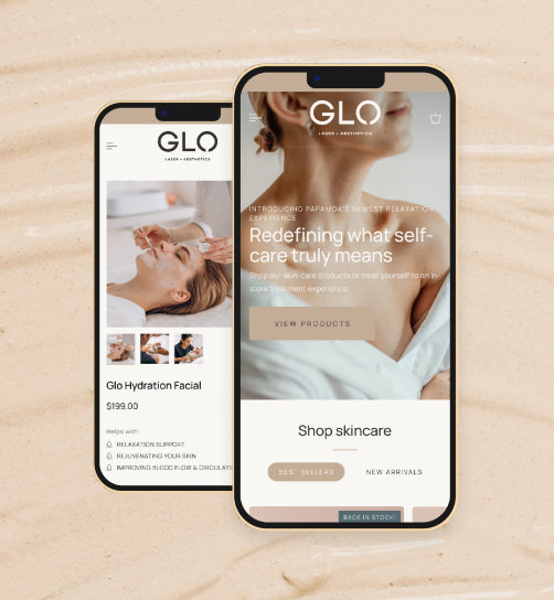
As a business owner, you understand the importance of customer engagement. The ability to engage your target audience, including existing customers, as well as potential prospects, is paramount to the success of your business. You probably also understand how important your company’s website plays in customer engagement, branding, marketing and sales. What you may not know is that the advancement in telecommunications technology has launched the next level in web design, known as responsive design.
Responsive Design
Responsive design is the response to the exponential growth in the smart phone and tablet market. Based on a recent report by the Interactive Advertising Bureau, while every other media medium has decreased in the past year, smart phone usage has been on the rise. At current, smart phone penetration of the market is at 51 percent, and is expected to rise to reach 72 percent in early 2014. The number of people that are actually utilizing the features that accompanies their smart phones has grown by more than 52 percent. This means that the number of people accessing your site from mobile devices will only increase.

What this means is that there are literally more people surfing the web on smart phones than desktops. This creates an issue with traditional web design. With traditional web design, sites are designed to function with devices that have screens that are a minimum of 12 inches. So when a smart phone user visits a traditional web site, they are unable to enjoy the full experience of the site. This increases your sites bounce rate (the percentage of visitors that leave your site shortly after landing on it).
Responsive design creates a dynamic element in which your site is optimized for mobile visitors, and it provides a view and experience based on the screen size of the device that is being used to access it. This means that smart phone users will be able to have the same experience as desktop users. Zyber specializes in responsive web design; providing complete mobile optimization. Mobile web browsing has increased in excess of 300 percent since 2011.
The Facts
More and more people are using mobile devices such as smart phones and tablets to access the web for everything from shopping to watching videos. Below you will find some eye opening statistics that will reveal the importance of transitioning to a responsive design website.
The number of people who own tablets has doubled in the past two years to reach more than 395,000. Market penetration is expected to grow another 60 percent over the next year.
More than 25 percent of smart phone users are shopping online between the hours of 6pm and 9pm.
Mobile advertising has increased by 196 percent in the last year.
While desktop use has decreased by 19 percent, laptop use has increased 13 percent, and smart phone use has grown by more than 26 percent. This trend is expected to continue.
No matter how you look at it, the landscape of web engagement has been revolutionized by the rise of the smart phone. The dynamics of web engagement require a responsive site that has the capacity to engage each customer based on the device they are using. Zyber has the experience and expertise to assist you in transitioning your current site into the world of responsive design. Zyber can also build responsive websites from the ground up.
Whether you have an ecommerce site or you simply use your site to provide information to your target audience, the level of your visitor’s experience will go a long way in determining how long they stay on your site, as well as whether or not they will return.
With this competitive market, you need every advantage that you can possibly get to level the playing field. The reach of the internet is infinite, and your ability to exploit its power is highly dependent upon the type of experience you offer your visitors. Allow Zyber to move you into the next phase of internet marketing.


