2014 has been a year of achievements for Zyber.
What better time than now, on the launch of our new business website, to have a recap of the year and look back at the milestones we met.
New Zyber Office
In January, we opened the New Year in an awesome new office on 669 Great South Road. A few touch ups and new coat of paint and the new office has been totally Zyberfied!
With plenty of parking available and great views of Penrose, our new office has provided the growing team with space to work and fit in some extra toys.
5 Year Anniversary
Having a big barbeque with the whole team and their families in Sunny February, Zyber celebrated its 5 year anniversary. From the companies humble beginnings in 2009, we have since helped hundreds of businesses get online and our team have honed their skills with every job they’ve completed.
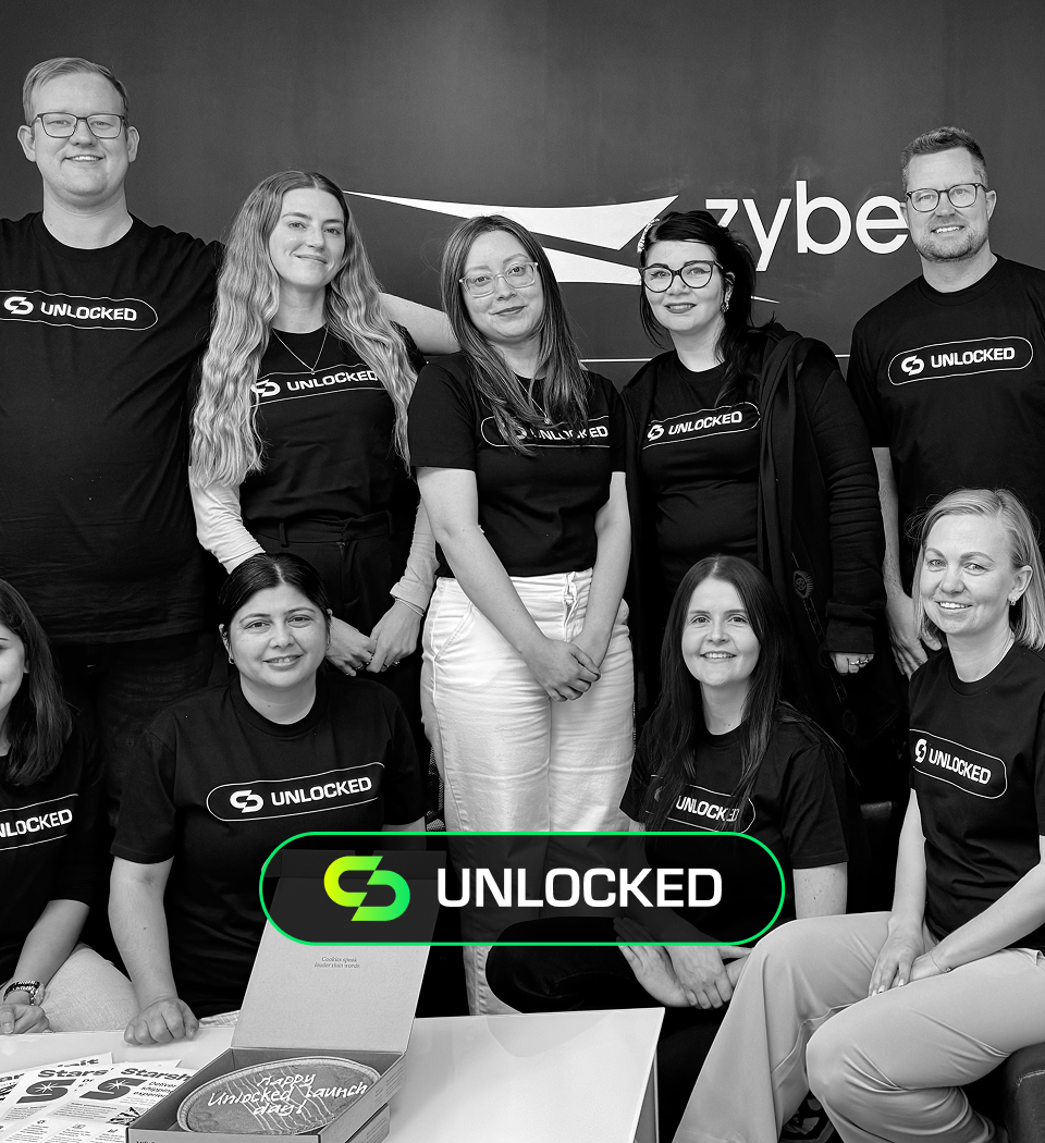
Zyber Grows To Over 20 Staff
The only way to maintain the huge demand for our services, while upholding the standard of quality we expect is to obviously expand our team.
2014 has seen growth in virtually every department of Zyber, the larger team enabling us to work on new initiatives, so that we can offer great new products to the market!
Deloitte fast 50
For over a decade, the Deloitte Fast 50 has been celebrating excellence in business and giving accolades to companies that are growing in their industries. We’re stoked to announce that this year Zyber was placed in the Fast 50 – and there’s no slowing us down!
New Zyber Website
This week we are launching our brand new website, to bring our online presence into the year 2014, while also showing off some cool new features in our production arsenal.
The site design has been built from the ground up to give visitors an awesome experience and learn everything they need to know about Zyber.
Responsive Design
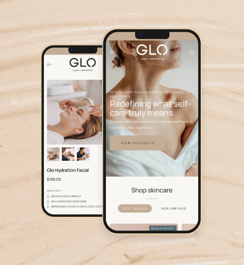
A big focus for our new site was to ensure that the mobile experience was just as great as the desktop. Touch friendly icons and an innovative side-navigation bar means viewing the Zyber site is always enjoyable.
Wide Screen
Websites are displayed on a wide variety of display sizes, and just as important as it is to make sure the site looks good on a phone, it needs to look good on widescreen desktop computers (or 60” TV screens like we have in our meeting rooms). Increasing our content width to 1280px means content can be spaced out, big images are even bigger, and less scrolling to read all a pages content.
Infinite Scrolling Gallery
Zyber has helped over 800 businesses get websites online. While we don’t expect people to look through all 800, we do want you to be able to get a good feel of our work quality by viewing a large portfolio – rather than cherry picking a few good ones. Our updated gallery of work will keep loading new images as you scroll, for an ever-updating showcase of Zyber designs!
Universal Sidebar
We want to make it easy to get anywhere on our site within a couple of clicks. The consistent sidebar makes it easy to bring up the sitemap and jump to where you want to be.
The sidebar also means you don’t have to scroll past a whole list of navigation buttons when you load a page, leaving more screen real estate for the important stuff.


